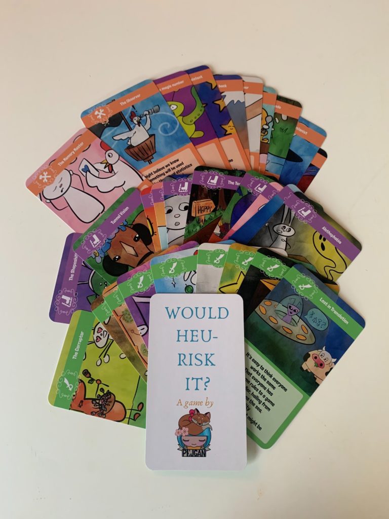
I was approached by Lena Wiberg to create 30 illustrations and the card layout for a card game she invented. The game is called “Would heu-risk it?” and it is a game created to help software testers learn about heuristics in testing in a fun way.
Concept
Lena gave me a list of card names and riddles that she had written, and a few suggestions for some of the illustrations. I had a lot of creative freedom in this project.
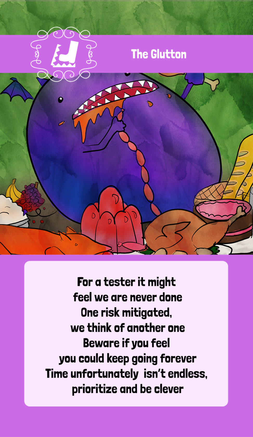
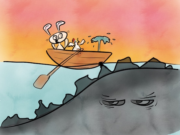
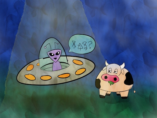
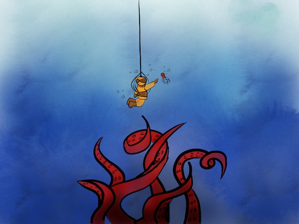
Lena wanted the illustrations to be cute and colourful, and I got the impression she liked a bit of an otherworldly air of mystique to them. I decided not to use any human beings as characters at all, opting instead for animals, aliens, and other strange beasts. The bunny and the chicken became a recurring character duo at some point. I kind of liked how they developed personalities along the way, having these adventures in this strange and colourful world.
Technique
I created the illustrations in an iPad app called Sketches. It’s easy to pick up, and the watercolour tool creates such a beautiful effect.
For each illustration, I created a very rough initial layer to set the layout using the pencil tool. Then I created a new layer and made outlines using the brush pen tool. Finally, I used several watercolour layers to colour in the outlines.
The watercolour tool can be a bit messy, so I generally didn’t bother to try too hard to stay between the lines, opting instead to erase the rough edges after colouring. I used the wet setting on the tool for most of the colouring, to get that interesting textured effect. Sometimes I dropped another colour on to it for an even more interesting effect.
One challenge was that the toolbars get in the way sometimes so it can be hard to colour right to the edges. I eventually worked out this can be solved by pinching and zooming out so that the edges of the picture don’t collide with the toolbars.
One thing I wish I had realised earlier was that the design of the cards has a massive effect on the layout of the illustrations. In this case, I was drawing rectangular illustrations but the final result was more square so the edges were clipped. Additionally, the final card design included an overlaid bar across the top that obscured about a fifth of the illustration. If I were to do it again, I would have been more mindful of this in my designs.
For the card layout templates, I initially used Canva, which was a terrible choice. Canva doesn’t scale well to 30 cards, and any resizing can only be done through a pro account which costs money. It is also extremely limited in terms of design tooling, so adjusting the images to fit the space on the cards was challenging. After Lena and I decided to enlarge the size of the cards, I ended up moving to Photoshop.
The icons at the tops of the cards were courtesy of The Noun Project. I freaking love The Noun Project so much.
Lena loved the end result! The game will be available for sale soon.