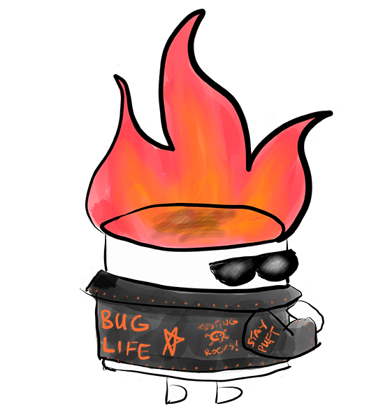
My friend Anne-Marie Charrett recently commissioned me to create a couple of artworks for her. The first is this badass testing marshmallow, which is in reference to her recent podcast interview by Keith Klain. The second was a car with wheels made of stone, made for a blog post she is writing.

These pieces were a great opportunity for me to try out the new iPad Pro and Apple Pencil that I recently purchased. Compared to using my finger as a stylus on my iPad mini, it’s a massive improvement. The bigger surface means I’m not having to zoom in as much to add detail, and the stylus gives me much better precision. And I should bloody hope so, because it was not a cheap upgrade. I bought the Logitech Slim Combo with detachable keyboard and it’s awesome. It has a sturdy, adjustable stand and the keyboard is much better than the Apple smart keyboard cover. It almost makes the iPad a viable alternative to my laptop, as long as I’m not doing anything that needs a serious computer (like programming, or using Photoshop, or serious vector drawing tools, or…so yeah writing and drawing only).
I’ve also started using Procreate, which offers some more Photoshop-y level features over Sketch (which I have been using up until now on the iPad mini). In particular, setting a transparent background is a big win. The smudge tool is great too, giving me greater control over colour blending. I haven’t fully explored this tool yet, which is quite exciting. The main beef I have with it so far is that the palm rejection is not great. It’s better than no palm rejection at all, but it’s still very annoying when I put my palm on the surface of the iPad and unexpected things happen to my drawing.
Each of these drawings presented a similar issue – how do I draw a simple object, simply, but still have it look like the object? Specifically, how do I make a sketch of a rock look like a rock, and a line drawing of a marshmallow look like a marshmallow? Rocks themselves are okay, but trying to convey that something is *made* out of rock is pretty tricky. Initially I drew the wheels on the car as thick, grey wheels with sharp edges and made them quite large to draw the eye to them. They still didn’t look quite rocky enough. So I ended up adding some rocks to the ground in the same style, to emphasize the connection between the rock-wheels and the natural rocks on the ground. I think it worked.
With the badass tester marshmallow, there were three very unique concepts to emphasize within a single entity – a badass, a tester and a marshmallow. The badass part was easy – biker jacket, sunglasses, done. The tester part I could take care of with the words on the biker jacket – testers don’t really *look* a certain way so that was the only reasonable way to address that. And for the marshmallow – well I thought if I just made it a puffy white cylinder then it wouldn’t say “marshmallow” enough. So I thought, what about a TOASTED marshmallow? That’s pretty badass too. Then I could put that delicious toasty marshmallow top on it. Just to drive the point home, I added a “STAY PUFT” slogan on its jacket sleeve. I think it works. The flames ended up adding some really great colour to what would have otherwise been a mostly black-and-white design, so I’m glad I went in that direction.
Badass tester marshmallows are available for purchase on Redbubble.